Categories
Design & UI

Social Media Logos and Branding

I love it when companies and social media services provide clear branding guidelines – especially when it comes down to how you may or many not use their logos. It removes any ambiguity.

I’ve compiled a short list of direct links to guidelines that, I’m sure, I will be referring to time and again…

The following aren’t social media related but are still handy for future reference…
Categories
Design & UI

SharePoint: University College Falmouth Intranet

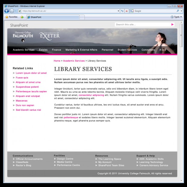
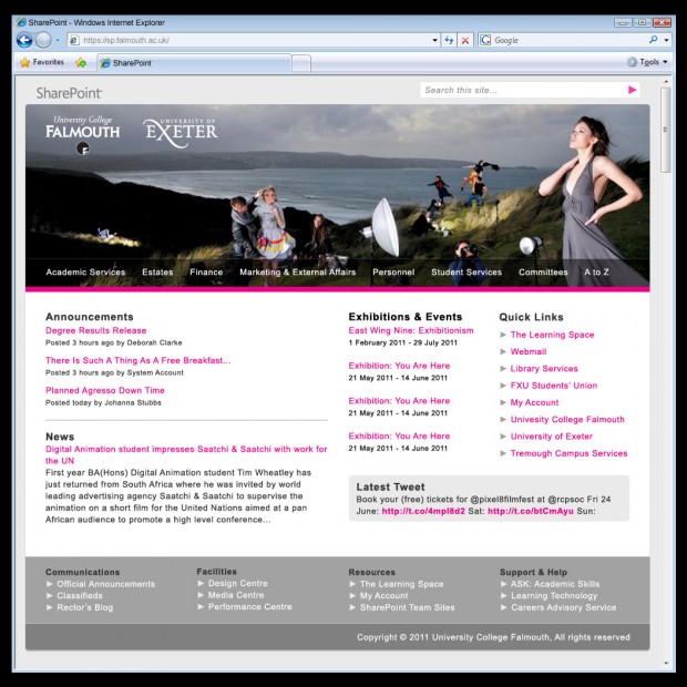
These design solutions were created as part of the University’s move from a 10 year old, bespoke, Classic ASP driven Intranet (which I originally developed) to Microsoft SharePoint 2010. Their purpose was to act as a starting point for discussion among staff and students and to generate feedback.

Homepage

Sub Page

Categories
Design & UI

Wings ‘n’ Things

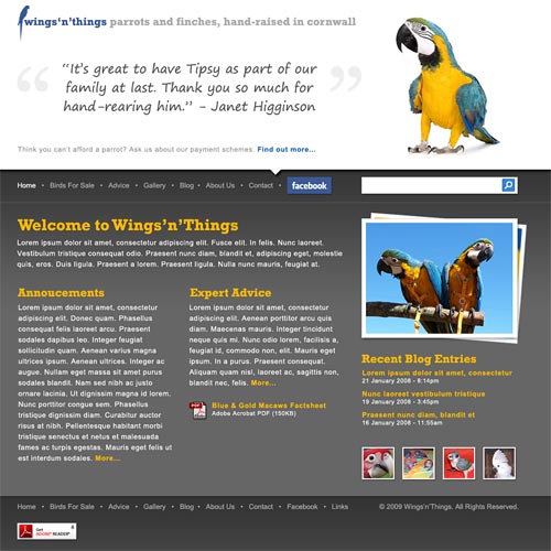
These screen solutions were based upon an existing website belonging to a local pet shop.

Sample homepage
The large page-header shows a random recommendation and photograph each time the page loads. The content welcomes visitors to the website, makes important announcements and offers expert advice. The latest news entries and gallery thumbnails are displayed within the right-hand sidebar.

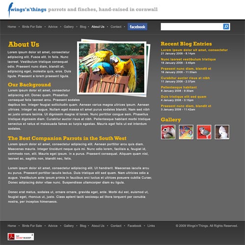
Sample internal page
All internal pages follow the same two-column layout as the homepage, but the page-header is reduced in height so only the site title shows. The primary navigation remains consistent throughout.

Categories
Design & UI

Islands of Richness with Silverlight on an ASP.NET page

I stumbled across this great tutorial by Brad Adams, titled ‘Islands of Richness with Silverlight on an ASP.NET page‘. Step by step it walks you through using and customising the ASP.NET MediaPlayer control and shows your how video can be added to an ASP.NET website.

Addendum: On the subject of Silverlight, this is an interesting development from Microsoft.

Categories
Design & UI

How to Destory the Web 2.0 Look

A nice blog entry from Snap2Objects, titled  How to Destory the Web 2.0 Look, takes a look at the ‘Web 2.0’ style that many websites have adopted and how others are fighting against it.

Categories
Design & UI

Flip-able Pages (continued)

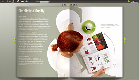
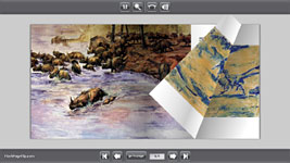
Back in August I asked several designers and developers for their opinions of presenting content within a flip-able, page-turning environment. At the time I wasn’t really sold on the idea, but a new service from Cubedesigners, called Fluidbook, does seem to be a step in the right direction. It seems much easier to view and browse than the previous examples I’ve seen.

FluidBook

Addendum: Additional sources for future reference.

Categories
Design & UI

Wanted: Your opinions on flip-able pages

A screenhot of the exampleI’m really interested in getting your developer/designer opinions on this type of Flash interface.

The concept of on-line publications with flip-able pages has been around for quite a few years now but has never really taken off. Why? I know my view on the subject but am very curious to know what others think of the concept.

  • Do you enjoy using publications presented this way or would you prefer to view a standard web page/PDF document instead?
  • Although the text is a little too small in my own basic example, do you think that you would take the time to read a document/magazine presented this way?
  • Might the technology be better suited towards certain types of publications, e.g. photography based, “coffee table” books?
  • Would the page ‘flipping’ begin to annoy you after a few clicks?

Further examples of this concept in use can be viewed at:

As always, any opinions/observations/views are much appreciated.